Transcripts
Cogito is the market leader in call center AI solutions, with over a decade of advanced R&D and hundreds of millions of analyzed phone conversations.
Their software performs live, in-call voice analysis to augment behavior in real-time to create better human connections at scale with your agents, wherever they work – in a contact center, in a BPO, or remotely.
However, a key feature offered by our competitors - the ability to view transcripted call audio - is currently missing from our product. This capability supports a myriad of use cases, including (but not limited to):
-
Understanding the words/phrases that triggered a topic notification
-
Understanding the context of a call when a notification is triggered
-
More easily vetting the accuracy and appropriateness of topic notifications
-
Quickly and easily scanning a call transcript to understand the conversation
-
Empowering clients to create their own topic notifications
-
Empowering supervisors to more effectively coach based on what agents say
Building transcripts will allow Cogito to provide a more compelling offering to our clients, and allow us to more easily troubleshoot issues with topic notifications.
Issue:
-
We only allow playback of audio, but we don’t have transcripts
-
We have the data available to us on the backend, but we’re not displaying it anywhere. (one reason is because there is sensitive data. Working to redact private info)
Solution
-
The ultimate goal of this project is to display full call transcripts, and the portions of those transcripts that include words/phrases that trigger a topic notification.
User personas who will utilize this feature:
-
Supervisors/coaches
-
These will be the primary users, as they more actively assess call outcomes and conduct QA and call listening. The ability to read call transcripts will make those processes more efficient.
-
-
Agents
-
Agents can benefit from this capability by reviewing call transcripts in the dashboard.
-
They may also eventually benefit when receiving Personalized Coaching, as they will be able to read call transcripts for calls flagged by supervisors/coaches.
-
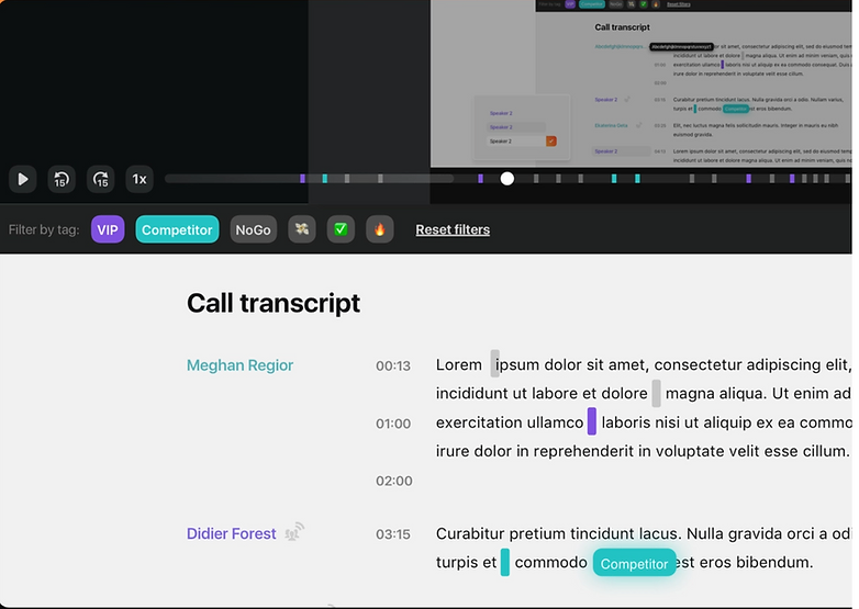
I started off by checking dribble for some inspiration. I wanted to see how other designers were displaying transcript and highlighting text. Here are a few of the examples of what I ran into.
#1
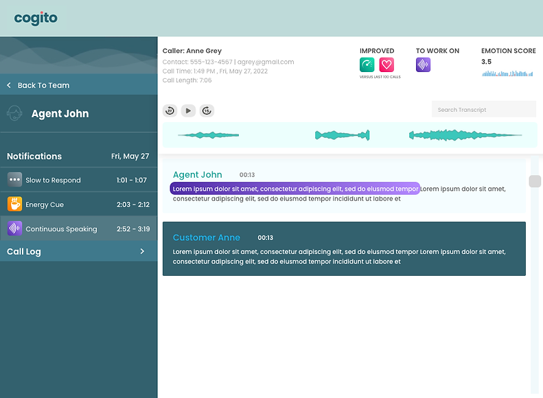
#2
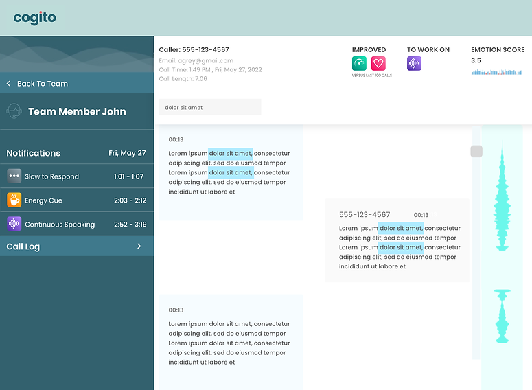
#3
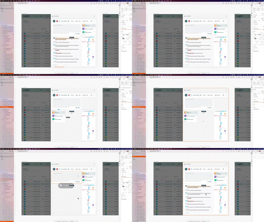
Now that I had some ideas on how I wanted to move forward visually, it was time to take a look at the requirements given to us. The list of requirements is too long to type out, but you can find it here. With these requirements I was able to start piecing together my first low fidelity wireframes using cogito official components , color guides, and text guides.
Eventually after 7 or 8 iterations..
E
Eventually we landed here and submitted these as official High Fidelity comps which satisfy all technical requirements in the doc and visually fits our branding and style.
Wireframe Conversion
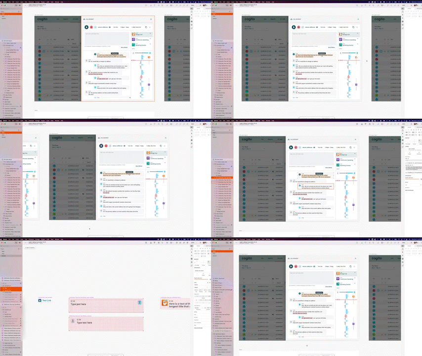
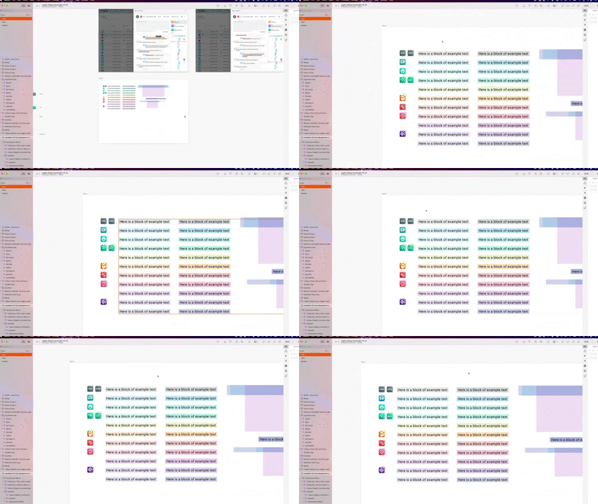
Admittedly, at Cogito we had huge dedicated Research Teams fo gather, test, and organize data. Our actual design team, however, had very limited resources. Teams were also very siloed at times so in between major projects I would often get random super low-fi wireframes from a random team and simply be asked to translate them to hi-fidelity using official components, style and text guides. Here are a few examples of this
Low Fidelity Wireframe #1:
This low fi wireframe was delivered to me by the research team
Hi Fidelity Wireframe #1:
I turned it into this hi fidelity screen using established brand components, color styles, text styles
Low Fidelity Wireframe #2:
This low fi wireframe was delivered to me by the research team
Hi Fidelity Wireframe #2:
I turned it into this hi fidelity screen using established brand components, color styles, text styles
Low Fidelity Wireframe #3:
This low fi wireframe was delivered to me by the research team
Hi Fidelity Wireframe #3:
I turned it into this hi fidelity screen using established brand components, color styles, text styles
Conversion AI Iconography
-
Overview
-
The existing Conversation AI offering limits the configuration of a topic’s appearance to one “blue notepad” icon, which appears both on real-time notifications (mini window and slide-ins) and in the Play Call View of Dialog.
-
-
Issue
-
A number of existing and potential clients have requested the ability to customize this icon so that it shows a different image and color.
-
-
Solution
-
Outline existing and potential future use cases for CAI, and create a shortlist of 10-15 icons and a palette of colors that clients can mix and match to create unique topic icons.
-
Designa dedicated frontend UI, as part of the Self-Admin initiative’s CAI configuration efforts.
-
This is important to clients from a branding perspective, but more important from a UX perspective. Agents are expected to respond to real-time guidance from CAI, but as they receive a larger selection of topics, it will become difficult to differentiate the guidance at a glance. The ability to assign unique icons/colors for each topic will aid tremendously.
So I created a doc that lists the most likely and requested word and phrase triggers, and took the tasked of selecting icons for each to create this icon palette.
-
Fraud: Agents receive reports of fraudulent activity from hotel franchisees.
-
Known Advisory: Agents are supposed to limit the use of incorrect terminology
-
Enhancing agent knowledge with knowledgebase links
-
Promoting self-service to users (e.g. tell customer that website is available)
-
Cross-sell/up-sell opportunities
-
Compliance (make sure agents follow specific steps/workflows)
-
Check offers for customer (look into promotions)
-
Use VZ engage (put item in cart for customer; read script in knowledgebase)
-
Check eligibility for VZ credit card
I also had to find icons for each vertical that we were covering:
-
Hospitality
-
Insurance
-
Telecommunications
-
Healthcare
-
Credit Card/Banking
-
Retail
And we needed icons to represent each call context:
-
Sales
-
Services
-
Collections
To keep icon styles consistent i decided it was best to stay within the same icon set. The Material Icons set, which is a collection of more than 900 icon symbols with color overrides
Here are the icons selected and the reasoning behind them:
.
Icons were then sent to Sales/Services team for approval.
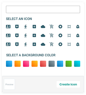
While waiting for that , I got started on the 2nd part of the solution: to design a dedicated frontend UI, where the user can design their own notifications by selecting a background gradient and icon.
After some initial research, I decided that Slack’s emoji selection menu was possible inspiration for a viable solution.
V1
Here we have a few iterations leading up to the final design...
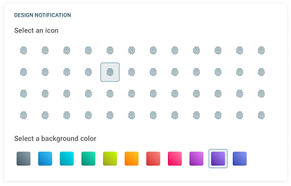
And we arrived here.
The idea is that as you set up the notification, you’ll be able to preview what it will look like and edit the text for it directly in that preview pane.
It made the most sense that the icon selection step will be some kind of dropdown menu as one of the last steps before the preview pane, where a user can select the gradient and icon they want, and as they select it, it appears in the notification preview in real time. Can’t forget hover states and selected states.

