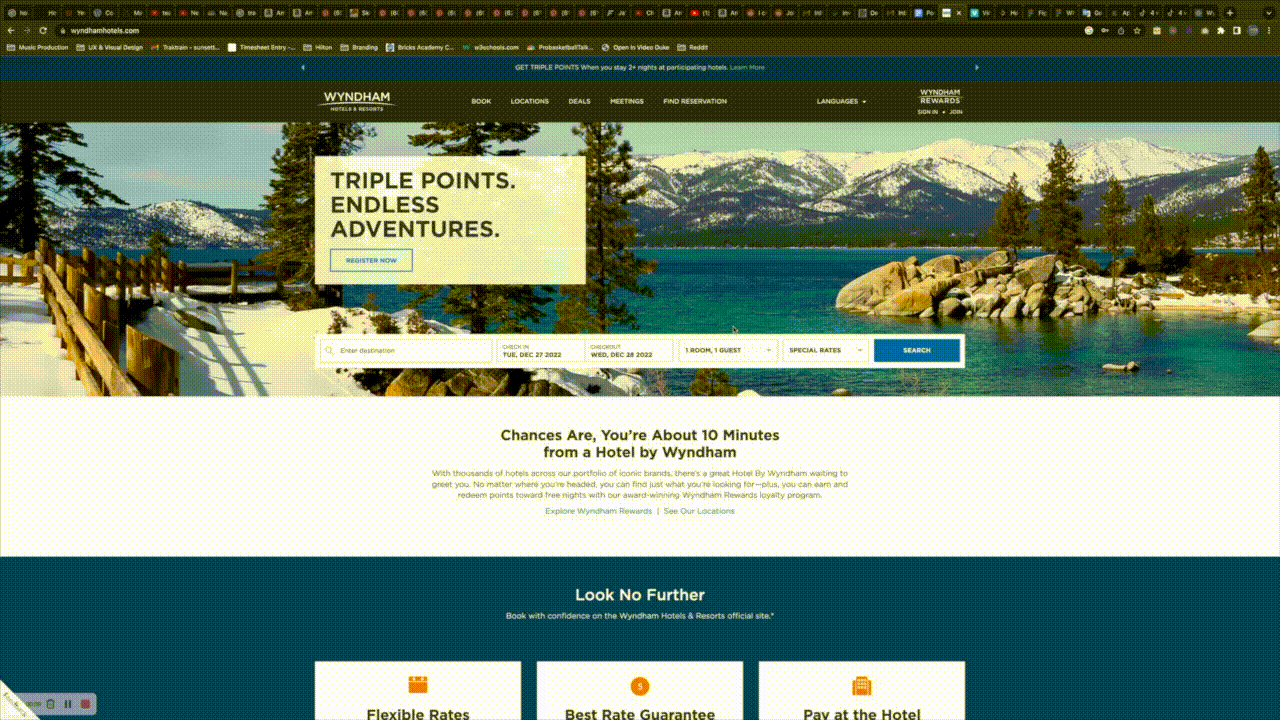
Wyndham Resorts
At Wyndham we were basically a 2-man design team, with a Marketing Team, Photography Team, and a small group of UX researchers at our disposal. Whenever we wanted to add a new feature, all of management had to sign off on it and it would become this big project.
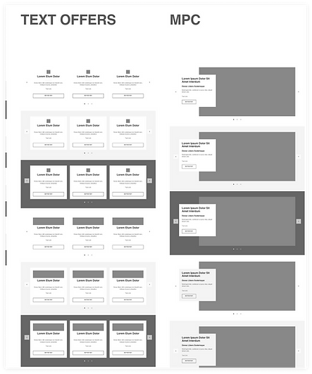
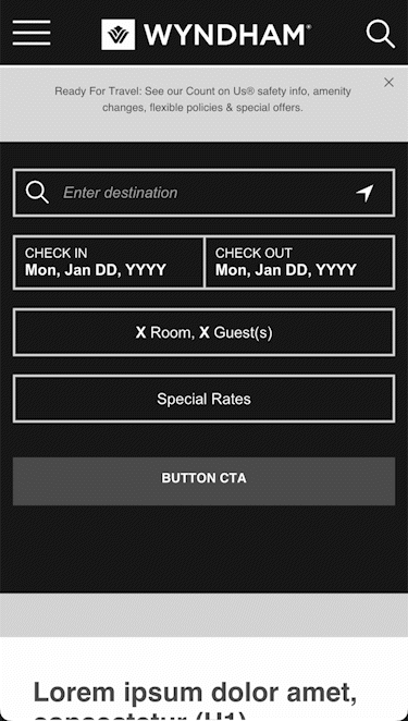
Global Wireframe Maintenance
One of the first projects I became in charge of the initial organization and maintenance of our Global Wireframes (mobile and web Component Library), which included all assets for all 21 of our brands. This was all done with Adobe XD and became the source of truth for all pages that were designed moving forward.
This was not a single assignment. This was ongoing from the first week I started.
Basically we built our websites (mobile & web) in ‘sections’. My job was to make sure we had a viable library of ‘sections’ that were 100% modular, that we could use like puzzle pieces to build any page in our network of websites.
This involved me spending weeks on the Wyndham websites combing through each mobile page, each web page, for each of the 21 brands and breaking down all design components so that I could inventory everything and get it positioned properly in our design system.
Here’s a couple of glimpses of what the file looked like.
Simply enough, each of the 21 brands had their own set of Style guides which basically just meant brand colors and text. I would mix and match these with some of the site components above and just like that we could build a new page very quickly.
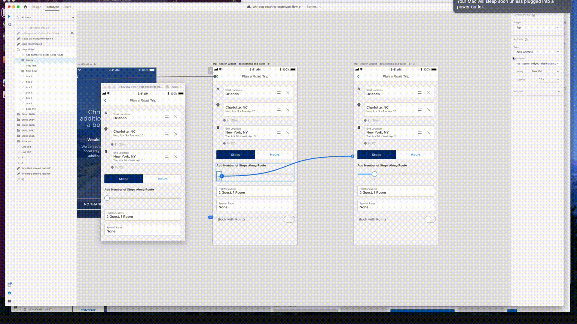
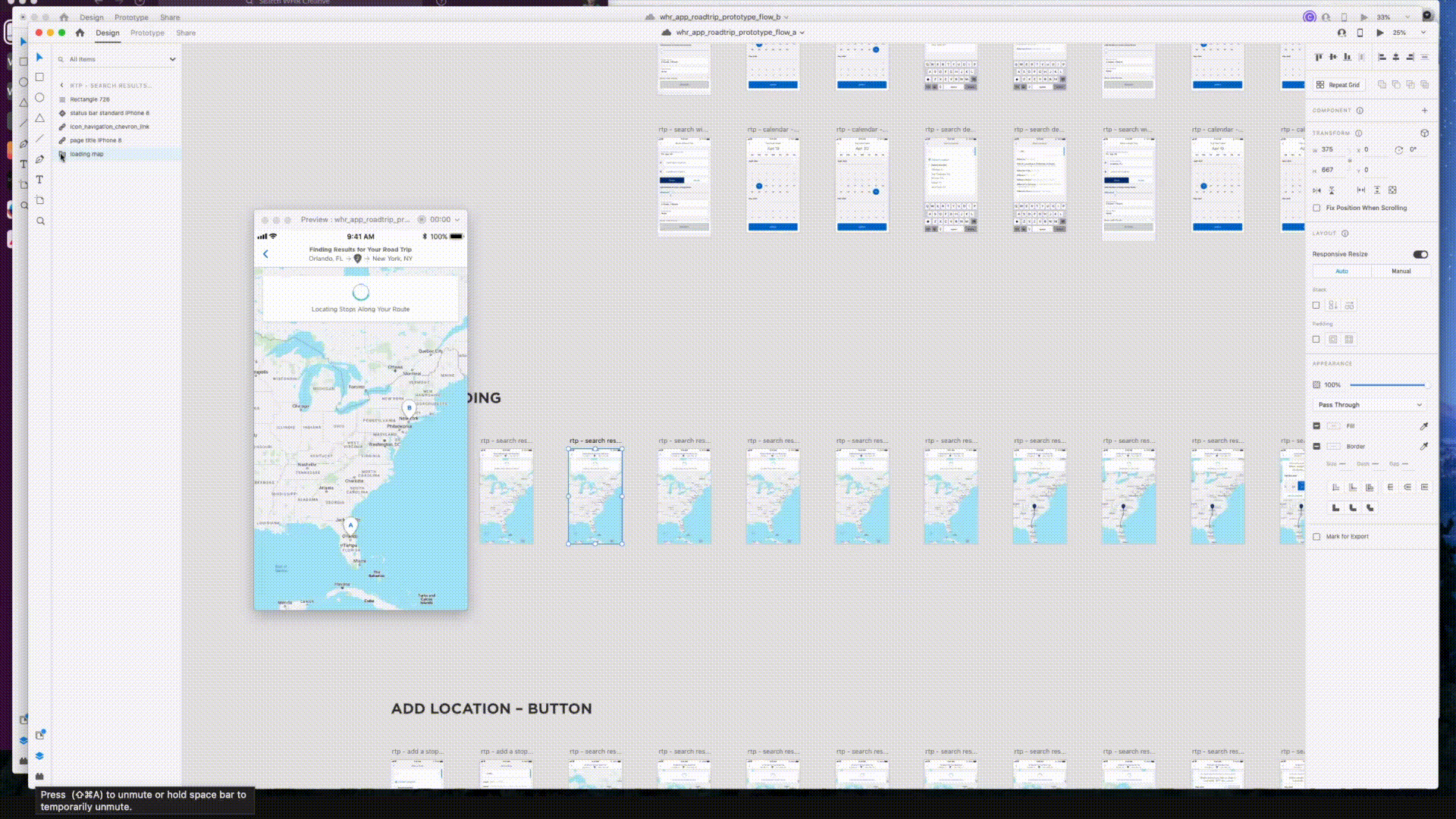
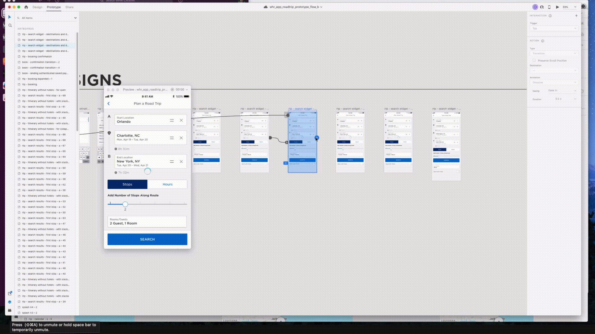
Prototype/Micro-interaction Examples
Not only did we design low and high fidelity wireframes, but we also prototyped them. Everything down to the micro interactions was designed and prototyped by us. Here are a few quick glimpses
—---------
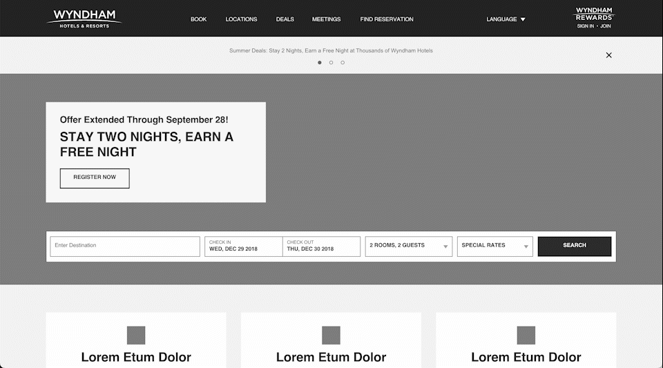
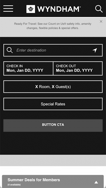
Retail banners
The Covid-19 pandemic definitely took the world for a ride. While the Wyndham network of sites remained strong, the need to communicate with our users increased heavily with the rise of questions, concerns, new policies, and overall information as a whole.
Issue:
There is no current way for Wyndham to communicate messages to users that visit the site. Those messages could be covid-19 related, property related, or even sales/deals related.
Goal:
To design a retail banner styled solution that allows Wyndham to communicate short messages to users that visit the site.
To get an idea of where to start with design, I decided to check out other popular retail sites for guidance.
After looking at about 40 different websites, I then compiled a list of those sites including screenshots of the homepage which allowed me to quickly analyze how these different retail companies were handling their banner situations.
After reviewing this list for a bit a few things started to stand out:
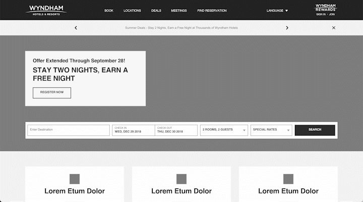
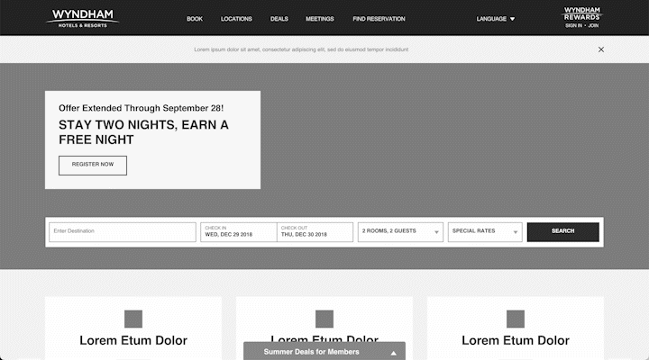
Some companies had their banner above site navigation
Some companies had their banner below site navigation:
Some sites even had banners both above and below:
Some sites had carousels in their banners
While others used bullet points to separate information
When I started noticing these trends, I then decided to run these 40 site screenshots through a type of SWOT Analysis.
A SWOT analysis is a strategic planning and strategic management technique used to help a person or organization identify Strengths, Weaknesses, Opportunities, and Threats related to business competition or project planning.
However, this analysis will be slightly different. It's called a SWCDUXO Analysis, where we’re going to take each site with their respective banner solutions and focus on their:
S - Strengths
W - Weaknesses
C - Content
D - Design
UX - User Experience
O - Opportunities
Based on the information that I could visibly see on the homepages of these companies, I defined the framework as such:
And by this framework I was then able to create an entire Excel sheet using information from those 40 sites to plug in the missing pieces. It ended up looking something like this:
The entire document can be found here
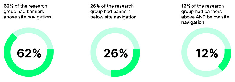
Sometimes the numbers can paint a pretty clear picture. This was one of those cases. It became clear to me that more companies were choosing to place their banners above the site navigation as opposed to below. That gave me a good idea on where to begin with my designs.
I also found that:
There also were a few standouts that I was able to identify almost immediately:
Apple was the only one that had this sleek, yet effective banner animation
Gap had a really neat slider drawer that slides open when you clock the arrow:
JCPenney had a 5 - page carousel
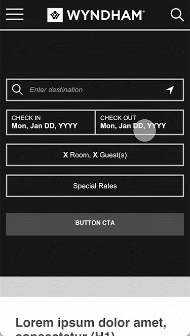
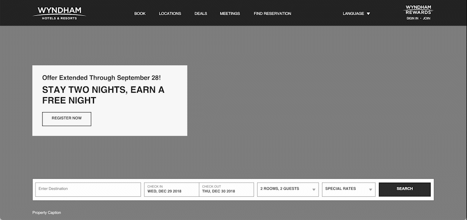
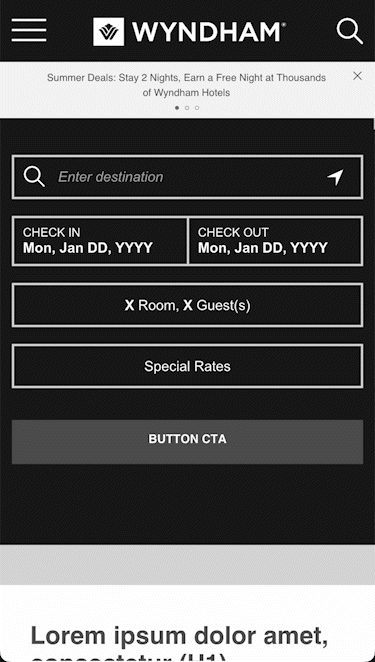
Solution
Here are 5 solutions that I designed and prototyped in Adobe XD. The solutions here are all below the navigation. I also designed and submitted these 5 above with above navigation as well.
Iteration 1: Slide-in banner. Heavily inspired by Apple
Iteration 2: Carousel banner 1. Heavily inspired by JCPenney
Iteration 3: Carousel banner 2. Heavily inspired by Reebok and many others.
Iteration 4: Slide-up drawer. Heavily inspired by Gap.
Iteration 5: Deals chip.
Solution
All 5 of these solutions were presented to various levels of upper management and a decision was eventually made and implemented. Iteration 3 ended up being the solution that all management agreed upon.
Oddly enough, despite what the numbers said, they opted for the Above navigation version of iteration 3. We packaged everything up and handed off to Marketing dept for copy and colors, then soon after that dev was able to implement live. 🙂
—----------------------------
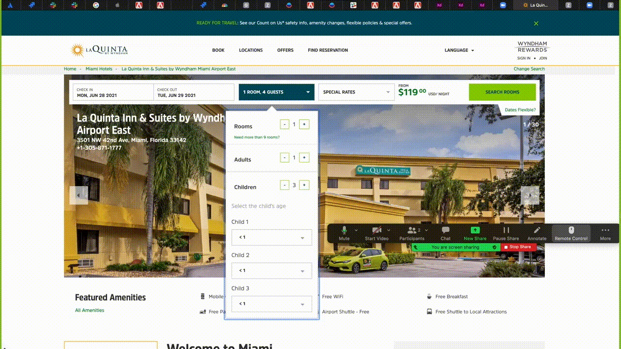
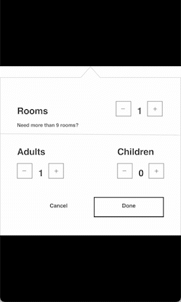
Party Mix
Issue:
When a user is in the process of booking a room, there is a strange height increase that occurs while selecting number of children. As you can see, even though there are 7 children selected, the menu cuts off right under Child 4, leaving us unable to select the ages for children 4-8. Even worse, this list is scrollable but there is zero indication of that… even while hovering over. The only way to know that you can scroll here is if you start scrolling.
Issue 2 :
The obvious simple solution would be to extend the height of the box to fit all of the children and age fields.
Only problem with that is, if a user is bringing 5-8 children then the box will have to extend vertically, plus you have to add scrolling there.
All of that just looks and feels awkward
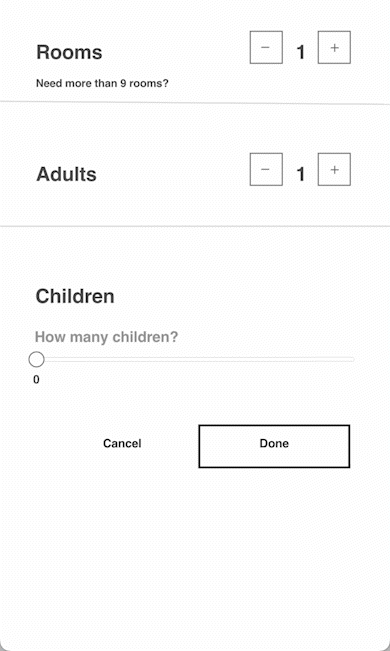
Solution: Here are some solutions that I designed and proposed
These were presented to upper management's delight. ☺️
I received nothing but positive feedback on these. Unfortunately my time at Wyndham ended before I could see either of these implemented, so I am unsure about how they left off.
—-------------------------------