Hilton
M3 - Complete Design System Overhaul of Hilton Mobile App
What is the M3 Project?
-
A complete tear down of Hilton's old mobile design system in Sketch and the rebuilding of a newer, cohesive, and more organized one n Figma
The Issue:
-
In its current state, the design system for the Hilton mobile app was super unorganized.
-
Component, color style, text style, and usage rules were not clearly defined.
-
Design and development debt was piling on because there was a lack of structure for our processes.
-
Design and dev teams were speaking different languages, referring to components by different names which was slowing dev process.
-
Sketch/Zeplin became kind of outdated for what we needed it to accomplish.
-
Figma provided us with a better way forward, so we had to rebuild our entire library there from scratch.
The Goal:
-
To transition the Hilton App from cross-platform style to one with components and leveraging of native design patterns.
-
This is NOT a focus on redesigning flows and major functionality.
Why are designers in favor of this?
-
From our perspective, rebuilding the design system from the ground up while leveraging native design systems made good design sense. It’s more user-focused, considering Android users will be more used to Android patterns and iOS users to iOS patterns. It made sense to give users something they were already familiar with.
Why are developers in favor of this?
-
From a Developer's perspective, rebuilding the design system from the ground up while leveraging native design systems would create massive improvements in speed, code etc.
What are we trying to do different?
1. Improve Culture
-
By speaking the same language
-
By starting together
-
With continuous collaboration
2. Improve Process
-
By aligning work around capabilities
-
By having 1 ticket for both iOS and Android
-
HANDOFF AVOIDANCE
-
If one has a questions on scope, requirements or approach, the solution is to have a conversation as soon as possible
-
Record outcome of conversation in JIRA ticket details or comments
-
-
Avoid Siloing
3. Improve our Architecture
-
With Modern, declarative, semantic UI
-
With “Data Ready” UI
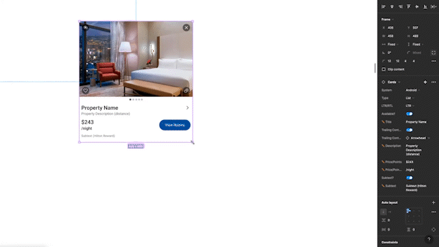
Component Library Atomic Breakdown
Step 1 - Atomic Breakdown of iOS (HIG), Android (Material 3), and Hilton Mobile Design Systems
-
Identify all Hilton-relevant molecules, atoms, and component types in for iOS and Androids respective design systems , then create a Hilton name for that component
-
Eventually it ended up looking something like this.
Step 2 - Building from the Bottom Up
-
We decided to start this project using a flow which was already in que for design. We wanted to build from bottom up, not from the top down so it had to be a new flow and not one that was already designed or in prod. Completely starting from scratch.
-
Just so happens that the flow we chose (Shop/Book Flow) was large and used a large variety of components. So we began to build from there
Step 3 - Roadmap
-
Through various ongoing scheduled meetings with DEV we were able to identify and roadmap exactly which components DEV planned on building and in which exact order, so we also designed the components in that order.
-
This ensured the Design and DEV teams were always aligned , working on the same components.
-
A direct result of this method was increased symmetry and visibility between Design and Dev teams which was crucial for the success of this rebuild.
Type Hierarchy
The Issue
-
We don't have a clear set defined type hierarchy.
-
The Development team has been asking us for one for months
-
Font styles aren’t consistent, and the disorganization slows down the dev team
The Solution
-
First, I identified multiple screens within multiple existing flows, and was able to define a consistent type hierarchy.
-
One thing to note is that we wanted to stay away from the conventional H1 H2… naming to a more semantic one. So , for example, instead of H4 it would be called ‘Button Label’ or “Title Large” instead of H1
Typescale
-
Material Design uses the Major 2nd scale - each font size that is used in layouts is 1.125x the size of the size below it ex: if you base body is 14 , then your smallest size above that is 16. We used that as a guide.
-
iOS seems to have manually scaled because they dont have a mathematical system
-
iOS (+1 or +2) and Android (1.125)
So I took a list of Material fonts + Apple fonts, identified consistencies between the two and pieced the nearest font sizes from each system together to create a new system.
For example, Body on Material is 16pt font. Body on iOS is 17pt font.
For our Hilton Design System I took these two tokens, created 1 single text style and named it “Body”. The font sizes (ios-17, android-16) will map automatically depending on which system you are on. Now, the "Body" text style that I just created for Hilton's design system, is using iOS and Materials native 'body" text from their respective systems
I did the same to all other relevant font sizes from our old screens and came up with 8 different text styles, and applied to each design system. These would be the exact text styles that I would use to build out the rest of the library.
Color Palette
The Issue
-
The color palette we were currently using was unnecessarily complex with repetitive colors used for a vast set of elements throughout the App (ie: System Gray #1, System Gray #2 …System Gray #7)
-
Current colors in use and iOS / Material native colors were not all accessible by Hilton accessibility standards
The Solution
-
Went through every screen on Zeplin and collected colors and what they were being used for so that I could narrow it down to what we needed colors to be assigned for.
-
Pretty much did the same thing with the colors as I did with type.
Lol so can you actually believe we were using this huge amount of colors in our old design system?
There's like 22 different grays on this list. lol. Finding the right gray sometimes would be a nightmare as you can imagine.
Anyway from that list, with the help of the UX Team and Accessibility team, we went from 54 color styles to 18, as you can see here. Every screen in the app can be built using these colors.
The Goal:
The goal here was to keep the color naming as semantic as possible. So instead of System Gray #14…we now have a “Screen Background”. This semantic naming structure greatly aided with communication between teams.
These colors were all checked for at least a 4:1 color contrast ratio using the WEBAIM Accessibility checker
-
Dark Mode - for every color on this list, there will be a corresponding dark mode color.
-
We asked DEV to help decide the semantic names, since they would be using them in the code.
-
Once we all discussed and settled on semantic color names, I loaded them into FIGMA library as color styles with detail documentation included.
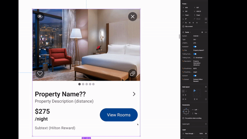
Figma Component Library Rebuild Using Autolayout, Variants, and Boolean Props
The Issue
-
It was time to build our new Design System using the Component List, new Type Hierarchy, and new Color Styles that we just created.
The Solution
-
The creation of the official Hilton Mobile Component Library ,which will serve as a source of truth for all designers and developers moving forward.
Page Naming / Progress Tracking
This is one big Figma file with multiple pages within it. Each component has its own page within this file. This list is also alphabetized so that those searching for components in the list can easily find what they are looking for. This is an ever growing doc, so as we design more components we will continue to add them here.
Here’s a snapshot of the page list. These are all components, and the emoji to the left is an indicator of the state of that component's completion.
For example
This system is one of those small yet effective things that lubricates the process. Now designers and developers don't have to click into each page to see the progress. They can instead get a quick view by glancing at the page section, without having to reach out to anyone or wait for a reply.
Artboard Layout
The layout of the component page is identical on every page, and can be broken down into 3 parts:
-
Body - Contains the component name, usage guidelines, and any FAQ if available
-
Variant Group - a container that houses all of the variants of component. This container is completely configured with autolayout
-
Sandbox - a small container nested within the body area, that houses the finished, fully linked component with all variants and boolean properties added
-
This section is where you would want to click to view different states of the component, or just play around with the boolean properties to see the changes.
-
This is to prevent anyone from accidentally clicking and changing or disorganizing our carefully built organisms in the variant group
-
Unforeseen Issues that Arose
-
This file was made by designers, for designers but was always intended to be viewed by everyone
-
The ‘sandbox’ on each component is unusable unless the viewer has edit access to the Figma file, so we opened it up and gave the developers editing access.
-
As you can imagine, with so many new people poking around with edit access, components and layers started disappearing, and becoming disorganized. Variant properties were being altered, our design file was becoming a bit of an organized mess.
Solutions to Unforeseen Issues
To create a situation where we have a master design file that both Designers and Developers have full access to, we decided to:
-
Once again lock everyone out of the file and only give access to the designers.
-
Using Figma's branching capabilities, we essentially created a branch (clone) of this master file, which will automatically update anytime a designer updates the real Master file.
-
We will then take this cloned Master file and give developers full viewing/editing access so that they can use the sandbox.
-
Now it's essentially a Master Design File that is for Developers only, and its called the DEVSHARE file.
-
This way the Developers can manipulate this file however they want and it won't affect the Master file.
The DEVSHARE file
-
Even though this DEVSHARE file is a 100% clone from the Master Design file, it was for Developers eyes only so we treated this a little bit differently .
-
This file by nature will be a lot more technical because of its audience.
-
It’s also a perfect place to include written documentation, usage guidelines, accessibility comments, and various other do’s and don'ts for all the components we had so far
-
Here's a glimpse of what a component looks like in the DEVSHARE file.
Team Communication
JIRA is an awesome tool …for developers. With so many different features and technical capabilities, it can be a little overkill for a design team to use.
We didn't want a situation where we were using 3-4 different apps (Jira, Slack, MS Teams, Outlook) going all over the place just to communicate. We wanted one centralized hub for communication so we decided to keep everything in Figma.
In addition to our regular design & dev meetings, Figma has awesome commenting capabilities built-in that you can link to your email and receive email updates whenever someone leaves a new comment. So for the designers , which include UX team, Accessibility Team, and UI team, 100% of our written communication regarding this project is here.
We also have an 'Outstanding Items’ page in the file where we update who’s working on what, questions we have for Developers, and any other notes.
Leveraging of Figma’s Technical Capabilities
Auto Layout
If there's ever a time where frustration can sweep in, it's when you’re using the auto layout feature in Figma. I admit in the beginning it was so frustrating for designers that we often tried to veer away from it when possible. But eventually, we realized that we had to master it to get where we wanted to go.
From there we went auto layout crazy, if you will. Every component was required to be built using auto layout. We got so comfortable with it that even beyond the components being inbuilt with autolayout, the entire page/artboards themselves were using autolayout for organization.
Boolean Properties
With our design system, some components have so many different uses, states, and variants, that you can easily end up with easily 40-50 different variants for 1 component. To reduce clutter, we require the use of Figma boolean properties when building every component. This allows us to toggle, swap, and overall manipulate the component to fit our needs, giving us maximum flexibility and future proofing.
Dark Mode
-
The Issue
-
Dark mode didn’t yet exist for the Hilton mobile App.
-
The Solution
-
Material Guidelines Highlight
-
Visual examples of the better approach for certain colors
-
Saturation levels of colors - Primary, Secondary, Accent
-
How to avoid eye strain
-
Maximize legibility
-
-
Used lightmode colors as a starting point and worked in conjunction with Accessibility team to develop accessible dark mode versions for each light mode semantic variant.
-
Started with the Material 3 guidelines for dark mode found at https://material.io/design/color/dark-theme.html because they have a much better illustration of how Dark mode can manifest compared to Human Interface Guidelines
-
This part was challenging in a different way, as we had to find the balance of saturation with colors on a black screen. But with the help of Material Design's Dark Mode guidelines and our Accessibility team, I was able to come up with this.


%201.png)